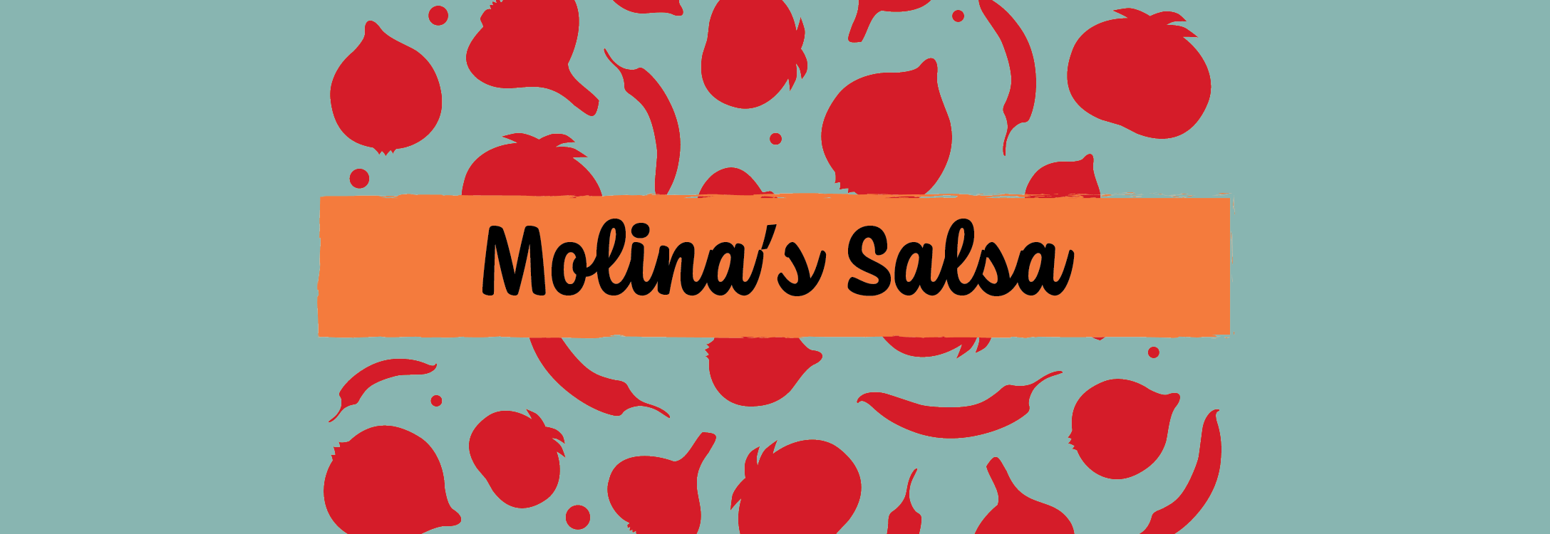
Molina’s Salsa
Tasked with creating packaging for a canned or jarred good, I came up with Molina’s Salsa. The name came from Alonso de Molina, who coined the name for salsa in 1571. The goal of the company is to go back to the basics and be as simple as possible; the name and the history behind it brings the consumer back to the roots of salsa and how simply it used to be made.
Process and Ideation
I started by creating three moodboards with different feelings. I came up with some ideas for a hand-printed stamp package, a fun paper cut-out label, or a patterned abstract feeling. In all of these ideas, I envisioned a textured background and lots of color.
When I started my sketches and the ideation process, I came up with a couple of different names. 1571, Molina’s Salsa, and Peppy’s Salsa were all contenders. I had also decided I didn’t want to have typical “mild, medium, hot” names for the different levels of spice. I experimented here with “on fire,” “calm & zesty,” and “easy-going.”
After receiving feedback, I went straight into rough digital drafts, coming up with one digital draft for each moodboard I had made. I’m showing two of them here because I feel that they both inform my final piece.
By my second round, I had received feedback to try combining some elements of both of my drafts. In the bottom draft, I was looking for a typeface that looked handwritten and I thought I wanted a script font. Instead, I ended up writing out the brand name myself using a linocut brush and adding that in. I liked the bright palette in the top draft but felt that the colors were a bit too much, so I distributed them differently. I was also experimenting with how to format the text box on the left, hence the three different options.
The biggest piece of feedback I received from this round was MORE COLOR!
Final Design and Mockups
Below I’ve included the final flat files and my mockups of the design on a salsa jar. After much experimentation with the textured background, colors, and type, I created something I feel is unique and exciting. Using my hand-drawn type for the name and a pattern I made gives it a simple and hand-made feeling, while still standing out on a grocery store shelf.
This project helped me understand more that it’s a great thing to combine multiple ideas, as long as it remains cohesive. I used to struggle with separating good elements of each idea and getting attached to a design as a whole, but this package design showed me a better way to work!


